Tuesday, September 2, 2008

Multimedia Experience: 3 Ideas

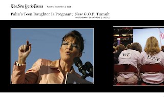
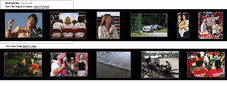
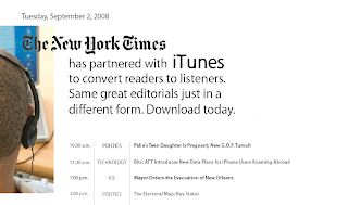
With two out of the three ideas, I was trying to explore alternate ways of providing news to my audience that would allow them to receive the same news in a quicker amount of time, or a way that worked better with their busy lifestyle. One of these ideas was to provide the articles in a form of a podcast. This way they could receive their news while working or doing something else. Urban professionals are busy people that have to multitask. Who has time to read anymore? They would be able to click on the article and listen to that, or they could click on the genre the article is in, an example being technology, and listen to other podcast able technology. The other idea is receiving an article in photo form. This way they could spend as much or as little time looking at the photographs. I set up the newsletter so that their are multiple slideshows within the newsletter, one "story" goes right to left and their so enough space between the articles so you can only see one slideshow at once. The last idea is more Web 2.0 friendly, were the reader has the ability to share the article with friends, save their favorite articles to an article account they set up, link to other articles like the article they just read, rate the article and post comments of the article they read. I am very aware that some of these sketches need a little, or a lot , more help compositionally.

Monday, September 1, 2008

Multimedia Experience: Urban Professionals

Urban Professionals are people who are educated individuals, have attended college and graduated. Their income ranges from the middle class to upper class. Their ages range from young individuals starting their first job to older individuals that have climbed the corporate ladder. I think that their interest range. Their topics of interest could fall into politics, business, technology, sports, science, health, arts, and or pop culture. (I stole all of these topics directly from the NY Times newspaper.) This is, however, mainstream America, although maybe they are not interested in what the majority of America is. They took a traditional road (go to college and be employed by someone) and have a nine to five job.

From this I narrowed down my audience to one person- a young individual that has been in their chosen field for around five years, they are interested in politics and technology, and love most of all long strolls on the beach. (Just kidding about the strolls on the beach.)   

Sunday, August 31, 2008

Design Systems: Three Concepts


It was rather hard for me to narrow down my results and after talking to a classmate, I began to doubt my choices. This conversion lead me in another direction of research however after doing the research I became more and more comfortable about my results. All of these topics are exciting and I will narrow my selections down to three topics, all of which I could grow from. After receiving five broad topics, transportation, place, ideas, energy, and information, I picked three topics, transportation, ideas, and place. 

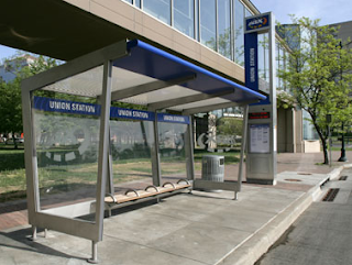
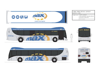
I was immediately drawn to transportation because of the sheer volume and body of work that can be produced and the different outlets of design that can be explored. Way-finding and environmental signage, print and screen based work would all be explored. Everything within the system has to be easily digested within seconds, allowing rushed, late individuals to arrive at their destination without getting lost. Scale as well as movement has to be considered. Is your identity legible when a bus is moving at 70 mph on the highway to a passing car or when it is a quarter mile away from a soon to be departing traveler? The research could be very rich, exploring the history of transportation, as well as the city that the transportation system is located in. 


I love parks. They are my most favorite place to be and to experience. I am inspired by sunlight and time and how sun interacts with the foliage. I think that the most magical thing in the world is when sun shines through the leaves at sunset and the color of the leaves become so pure... i can't explain it, it can only be experienced through visual senses. The closest thing I can compare it to is wet paint. The identity would be rather abstract I'm thinking, inspired by what I mentioned above.


The last I will mention is the identity that would fall under ideas. I think that as a designer, you are part of the media, creators of the collection of images that people see everyday. Design is a tool and effects everyone. It can educate and has the ability to reach thousands of people in a short period of time. One of my past instructors, the lovely and talented Brockett Horne once said, and I am paraphrasing, that the reason she like graphic design so much, over
 the fine arts, is the ability to reach thousands upon thousands of people. If you are a fine artist, your work will be shown in a gallery, and the audience of people is quite small, but the work that we will produce, she used the example of a billboard on a highway, will be passed by
 thousands of people in one day. That is not something that should be taken lightly. And that thought leads me to what I would like to do, create a campaign for a charity that can educate individuals on the crisis of AIDS. AIDS is a topic that I am passionate about and can fuel my work and research throughout the semester. The challenge is to rebrand a subject that has already been branded, to create something fresh and powerful. The charity that I am making up will help educate every continent. I would like to create an identity and have sub-identities that would represent continents or countries that are particularly hit by the AIDS epidemic, exploring culture and the best way to communicate to a culture through graphic design.


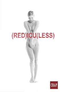
A current corporate campaign called Product (Red), that donates a portion of proceeds to people suffering from AIDS in Africa. 


A parody of Product Red, emphasizing the fact that it is not through buying that we change the world

Thursday, August 28, 2008

Visual Language: Audience

My audience are Latino voters between the age 24-44.

Shared Values

My audience's shared values are that of strong spiritual faith and the dedication to family yet are independently driven. They also pride themselves on hard work and determination. 

Political Issues

The political issues that are important to my audience are economic opportunity, education, immigration, health care, civil rights, poverty, foreign policy, and faith. 6.9 percent of Latinos are without a job. Many latino worker are in low-paying jobs and many latinos have a hard time moving up to better paying jobs. There is a gap in schools throughout America. Dropout rates for Latino-American are significantly higher than white Americans and the average debt for Latino leaving college is $11,500. 500,000 people enter the United States from Mexico illegally each year. The immigration bureaucracy is burdened with applicants and therefore it takes many years for people to receive the opportunity to become a citizen. Currently one in three Latinos do not have health care. Out of all the ethnic groups living in America, Hispanics have the lowest median wage and injustice within the criminal justice system among Hispanics is prevalent. Twenty two percent of Latino American are poor. The aspect of foreign born citizens factor more within the Latino community than in other ethnic communities. 

Cultural References

It is important to know that there are many different cultural groups that make up the latino community. This stems from the multitude of Latin countries that comprise South America and North America. 

Graphic Landscape

The majority of the Latino community makes around $30,000 a year. They reside in urban environments or suburb communities on the outskirts of the city. The latino family is often large and the hierarchy within the family as well as elder respect is of high value and importance. The young latino community is interested in communication devices and tools, such as cell phones and texting, facebook, pop culture, appearance, jewelry, music, and their community of friends and family.  

Why aren't they voting?

They are too busy, there was a voting registration problem, they were ill or not feeling well, or they were not interested and felt like this decision was not important to their life. :( 


Visual Language: Definitions Directly from our Reading

metaphor: resemblance through substitution 
personification: inanimate objects represented by human qualities and characteristics
metonymy: using a name of one thing to stand for another
synecdoche: using one part to represent a whole or vice versa
pun: one symbol having two or more meanings
hyperbole: exaggerating for the sake of emphasis
antithesis: a sharp contrast between two opposing thoughts
irony: a deliberate contrast, opposite of the expected
allegory: a symbolic representation
parody: imitating work of another in a humorous way

Wednesday, August 27, 2008

A New School Year and Fresh Start!

Although I did not revise my information graphic, a project that is still looming over my head, I did work with the lovely and talented Monina Velarde to set up an identity. We applied that system to signage and other materials for the school of design. To check out what we did please visit our blog, Designing Identity.

I am so glad to be back. Yah for new beginnings! Cheers!

Thursday, May 15, 2008

Wednesday, May 14, 2008

PROJECT FOUR: Realized Potential

Dearest Jamie,

It is hard to believe that it is almost half a day after the due date and I am only this far. I have a lot to still work on. My typography really needs to be refined. I think that the micro detail shoots are working but when you look at it from the whole it does not look refined, the piece itself. I still need to add my title, legend, and one more block on text. 

PROJECT FOUR: Realized Potential Type Treatment


PROJECT FOUR: Realized Potential Type Treatment


75% transparency


85% transparency


35% transparency


50% transparency


Right now it is at 100% in my document.

PROJECT FOUR: Realized Potential

Friday, May 9, 2008

Wednesday, May 7, 2008

PROJECT THREE: Earlier Sketches


Declaration for Project Revision

I would like to redo my first project. There seems to be a disconnect between my typography and image. It is too much for the viewer to read when looking at my information graphic. There should be visual clues, perhaps a key, to allow the viewer to easily sort through the information. The vertical format does not seem to be working. The analphabetic symbols are not enough of a clue to separate the categories. Symbols with more of a differentiation will work better. I want the viewer to read the graphic easily to understand the content within the graphic. I want the viewer to read the graphic easily to understand the content within the graphic.


Thursday, April 24, 2008

Peter Funch


These are the images that I altered to get my background images.

Charley Harper's Work